For week 13, the
Picaboo theme and challenge was learning how to properly crop a photo. This seems obvious, but I can't count the number of times I've taken a great photo only to find out that the 4x6 version just doesn't look as great or somebody's limb got "cut off". Again, I'm also happy to report that the photo above made it into
Picaboo's blog!
 |
| Kaylie |
 |
| Kaylie |
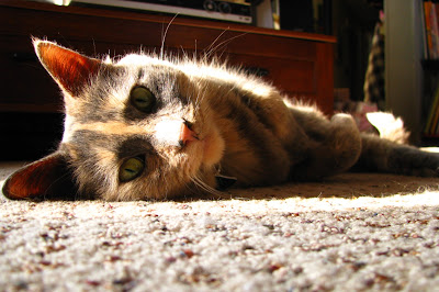 |
| Gizmo soaking up some sun |
One of the easiest ways to make sure your subject doesn't get over cropped when you want to print the photo is to take a step back and include a little more background than you need. You can always crop what you want later as you may not always have the chance to go back and take more pictures. Most photo programs allow you to crop to specific ratios as well. This allows you to see what your photo will look like as a 4x6, 8x10 and so on.
 |
| Lilac leaves budding |
 |
| Nesting hawks |
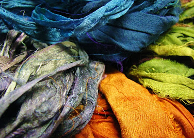 |
| Sari silk ribbon |
I got quite a few great shots over the week and cropped each of them to various ratios like 4x6, 8x10 and 5x7 to see what they looked like. It made it much easier when I started to take a step back and include some excess background so I could position my subject as I pleased.
For week 14,
Picaboo's theme and challenge was about reading histograms. Those are those little graphs that show the light and dark values in an image. The photo you see above was featured in
Picaboo's blog as well!
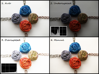 |
| The graph is too much to the left in #2 and too much to the right in #3. |
|
Before this I never gave histograms much thought but they can be helpful in determining if your photo is too dark or light before you upload onto your computer. Most cameras allow you to view the graph after you've taken the photo somewhere in the display settings while in the photo viewing mode. If you cannot find it, look for it in your camera's manual. The dark side is on the left and the light is on the right side of the graph. For the most part you want a balanced photo with the graph peaking in the middle or near the middle. Of course this isn't always the case depending on what you're shooting and what outcome you're looking for.
I started paying attention to my histograms this week and it was nice being able to tell if my photo was going to be too dark, too light, or just right before I uploaded onto the computer. It can be hard to tell when looking at the little display screen on the camera.


Love the ones of the cat, and the sepia one of Kaylee. You take great pictures!
ReplyDeletewww.AllThingsTangled.blogspot.com
Thank you! I love the one of my kiddo too, she loves to pose for me :)
DeleteBeautiful pictures! Kaylee is so adorable!
ReplyDelete